이전 글 (2014/11/13 - 서포트 라이브러리(v7)로 Material Design 적용하기 - (1) 머티리얼 테마 적용)에선 서포트 라이브러리를 사용하여 애플리케이션에 머티리얼 디자인을 적용하는 방법에 대해 알아보았습니다.
이번 글에서는 머티리얼 테마와 함께 색상 테마를 적용함으로써 일관된 느낌을 유지하면서 각 애플리케이션 고유의 느낌을 낼 수 있는 방법에 대해 다루겠습니다.
적용 가능한 색상 테마 종류
기존과 동일하게 style.xml 에 테마를 정의하여 머리티얼 테마를 적용할 수 있습니다. 서포트 라이브러리를 사용할 경우 지정할 수 있는 항목은 다음과 같습니다.
- colorPrimary: 아플리케이션의 주 색상입니다. 대표적으로 지메일이나 유튜브의 빨간색, 구글 뮤직의 주황색을 들 수 있습니다.
- colorPrimaryDark: 주 색상 계통에서 조금 더 어두운 색상입니다. 상태바 색상을 별도로 지정하지 않을 경우 상태바 색상으로 사용됩니다.
- colorAccent: 강조 색상으로, 보통 주 색상과 대비되는 색상을 지정합니다. 중요한 역할을 하는 UI 요소에 주로 사용합니다.
- colorControlNormal: 컨트롤러(EditText, 체크박스, 라디오버튼, 프로그레스 바 등)에 사용합니다. 비활성 상태/선택한 상태 등이 아닌 '일반적인' 상태에 적용됩니다.
- colorControlHighlight: 컨트롤러를 터치하거나 선택되었을 때 표시할 색상입니다.
- android:navigationBarColor: 네비게이션 바 색상입니다.
테마로 지정한 색상이 적용되는 위치는?
뒤에서 작성할 예제의 모습들입니다. 색상이 어디에 적용되는지 직접 확인해보세요~

EditText 위젯은 적용되는 API Level에 따라 적용되는 모습이 약간 상이합니다. API Level 21(Android 5.0) 에선 윗 부분에 colorControlNormal 색상, 아랫 부분에 colorAccent 색상으로 적용되지만, 하위 버전에선 colorAccent 색상 하나만 표시됩니다.

Overscroll시 나오는 물결 무늬의 색상과 스크롤바 모습의 모습입니다. 각각 colorPrimary, colorControlNormal 색상이 적용됩니다.

멀티태스킹 창에 표시되는 앱 제목 표시줄 색상은 colorPrimary 색상으로 표시됩니다.

사용자가 직접 위젯을 컨트롤할 때는 colorAccent 색상이 표시됩니다.

위젯에 대한 터치 피드백은 colorControlHighlight 로 표시합니다. 아쉽게도 이 효과는 API Level 21 이상에서만 표시됩니다.

테마 적용해보기
위에서 살펴본 예제를 직접 만들어 보겠습니다. 아마 지금까지 작성한 강좌 중 가장 쉬운 에제 중 하나일 것 같네요 -_-
우선, 새 프로젝트를 생성합니다. 액티비티 한 개가 있는 프로젝트를 생성한 후, 애플리케이션 모듈의 build.gradle의 dependency 에 다음과 같이 appcompat-v7 라이브러리가 추가되었는지 확인합니다.
[build.gradle]
dependencies {
compile fileTree(dir: 'libs', include: ['*.jar'])
compile 'com.android.support:appcompat-v7:21.0.0'
}
위에서 주의할 점은, 액티비티가 ActionBarActivity를 상속하는지 확인해야 합니다. 만약 액티비티가 ActionBarActivity를 상속하지 않을 경우 테마가 제대로 적용되지 않습니다.
다음으로, 두 가지 버전의 styles.xml 파일을 준비합니다.
- values/styles.xml: API Level 21 미만에서 사용하는 테마
- values-v21/styles.xml: API Level 21 이상에서 사용하는 테마

<resources>

    <!-- Base application theme. -->

    <style name="AppTheme" parent="Theme.AppCompat.Light.DarkActionBar">
        <item name="colorAccent">#FF4081</item>
        <item name="colorPrimary">#3F51B5</item>
        <item name="colorPrimaryDark">#303F9F</item>
        <item name="colorControlHighlight">#00CC55</item>
        <item name="colorControlNormal">#FF0000</item>
    </style>

</resources>
<?xml version="1.0" encoding="utf-8"?>
<resources>
    <style name="AppTheme" parent="Theme.AppCompat.Light.DarkActionBar">
        <item name="colorAccent">#FF4081</item>
        <item name="colorPrimary">#3F51B5</item>
        <item name="colorPrimaryDark">#303F9F</item>
        <item name="android:navigationBarColor">#303F9F</item>
        <item name="colorControlHighlight">#00CC55</item>
        <item name="colorControlNormal">#FF0000</item>
    </style>
</resources>
테마 설정은 이것으로 모두 완료되었습니다. 마지막으로 아래 레이아웃을 메인 액티비티의 레이아웃에 적용합니다.
[activity_main.xml]
<ScrollView xmlns:android="http://schemas.android.com/apk/res/android"
    xmlns:tools="http://schemas.android.com/tools"
    android:layout_width="match_parent"
    android:layout_height="match_parent"
    tools:context=".MainActivity">

    <LinearLayout
        android:layout_width="match_parent"
        android:layout_height="wrap_content"
        android:orientation="vertical"
        android:paddingBottom="@dimen/activity_vertical_margin"
        android:paddingLeft="@dimen/activity_horizontal_margin"
        android:paddingRight="@dimen/activity_horizontal_margin"
        android:paddingTop="@dimen/activity_vertical_margin">

        <EditText
            android:layout_width="match_parent"
            android:layout_height="wrap_content"
            android:hint="Edit text" />

        <CheckBox
            android:layout_width="wrap_content"
            android:layout_height="wrap_content"
            android:text="Checkbox" />

        <RadioButton
            android:layout_width="wrap_content"
            android:layout_height="wrap_content"
            android:text="Radio" />

        <android.support.v7.widget.SwitchCompat
            android:layout_width="wrap_content"
            android:layout_height="wrap_content" />

        <TextView
            android:layout_width="match_parent"
            android:layout_height="300dp"
            android:gravity="center"
            android:text="Long\nLong\nLong\nLong\nLong\nLong\nLong\nLong\nLong\nLong\nLong\nText" />

        <ProgressBar
            android:layout_width="wrap_content"
            android:layout_height="wrap_content" />

        <ProgressBar
            android:id="@+id/progressBar"
            style="?android:attr/progressBarStyleHorizontal"
            android:layout_width="match_parent"
            android:layout_height="wrap_content"
            android:indeterminate="true" />

        <RatingBar
            android:id="@+id/ratingBar"
            android:layout_width="wrap_content"
            android:layout_height="wrap_content" />

        <Button
            android:id="@+id/btn_alert_dialog"
            android:layout_width="wrap_content"
            android:layout_height="wrap_content"
            android:text="Alert dialog" />

    </LinearLayout>
</ScrollView>
완성된 예제를 실행하면 다음과 같이 테마가 적용된 모습을 확인할 수 있습니다. 아직 서포트 라이브러리의 지원 범위가 제한적인지라, 안드로이드 5.0 이전 버전의 단말기에서는 일부 위젯에만 머리티얼 테마 및 색상이 적용됩니다.
 |  |
이 포스트에서 사용한 예제는 아래 링크에서 확인할 수 있습니다.
'유저 인터페이스 > Material Design' 카테고리의 다른 글
| Support Design Library (Google I/O Extended Seoul, 2015) (2) | 2015.07.14 |
|---|---|
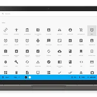
| 머티리얼 디자인(Material Design)에 어울리는 아이콘 (1) | 2015.06.02 |
| 액티비티 전체를 덮는 네비게이션 드로어 만들기 (9) | 2014.11.17 |
| 네이게이션 드로어에 머티리얼 디자인 적용하기 (8) | 2014.11.16 |
| 서포트 라이브러리(v7)로 Material Design 적용하기 - (1) 머티리얼 테마 적용 (1) | 2014.11.13 |